As described here we are pleased to announce the new design of our D365 portal in D365 version 2.9. We completely rebuilt the design and optimized the website performance to reduce load time.
We now make use of the latest Bootstrap framework and optimized all Client-side Styles and Code to reduce load time as well as using the Javascript framework AngularJS and SignalR for receiving a great website performance. The whole website now uses these technics for a good user experience with immediate response times – the user sees what´s going on, f.e. when opening a distribution list manipulating members of a distribution list or when syncing data.
The page setup is renewed and the menu has been cleaned up somewhat.
General design changes
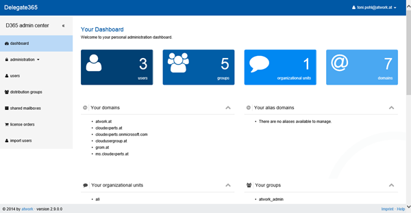
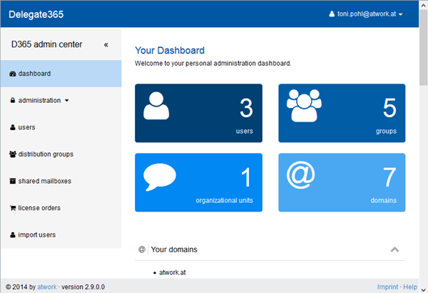
The portal dashboard page now looks like in this first screenshot:
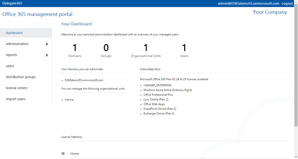
In comparison to the previous design (versions up to 2.8):
The whole page setup was renewed and offers additional features (click to enlarge):
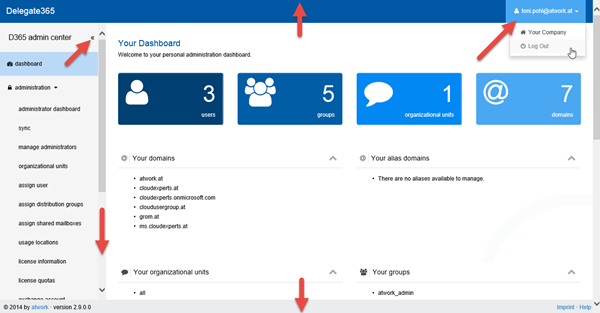
The header and footer now stay always visible on the top and bottom of the page. The logged in user appears in the upper right corner and there´s a small menu for editing the company data as well a logout button.
Also when opening a menu in the left a vertical scrollbar appears if the menu does no longer fit on the screen. On the right of the “D365 admin center” there´s a Menu Toggle-Icon for hiding the left main menu.
Menu Toggle
The menu visibility can now be controlled by the Menu Toggle-Icon.
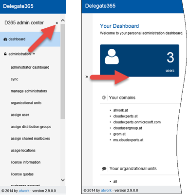
To show the main menu click the Menu Toggle-icon on the left side. With this function the main content area can be increased easily.
Menu Changes
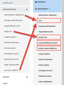
The menu bar on the left side was adapted somewhat. The graphics shows the changes in menu “administration” between the previous versions compared with 2.9 (click to enlarge):
- The menu “assign ou” is now called “assign user”. Here portal admins can assign users to a specific OU who are not assigned in D365 till now (f.e. new users which were created outside of D365).
- The link “Unassigned distribution lists” which previously was in the “administration dashboard” has been moved into an own page with the title “assign distribution groups”. Here (new) distribution lists can be assigned to a specific OU (the same as assign user but for DL).
- There´s a new function “assign shared mailboxes” for doing the same as described above – for shared mailboxes. This is a new feature supported in this version 2.9.
- All methods for doing a manual synchronization have been moved from the menus “administrator dashboard” and “user sync options” to the new menu “sync”.
The main menus now have icons. The vertical scrollbar appears if necessary.
The Dashboard
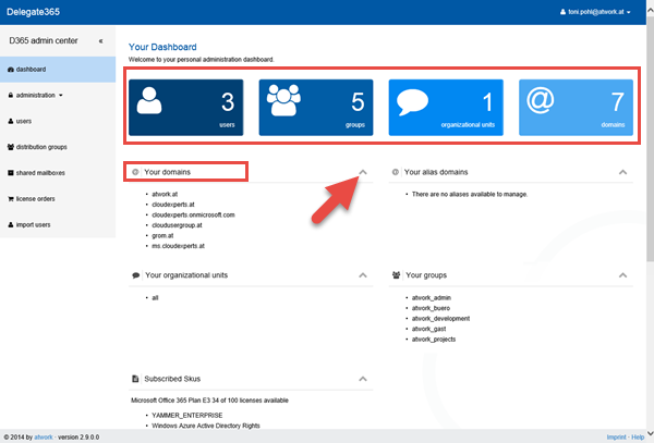
In the dashboard dark blue to light blue boxes show the number of users, groups, organizational units and domains for the logged in admin. The headers below also use the same icons can be toggled as well.
Toggling for sections
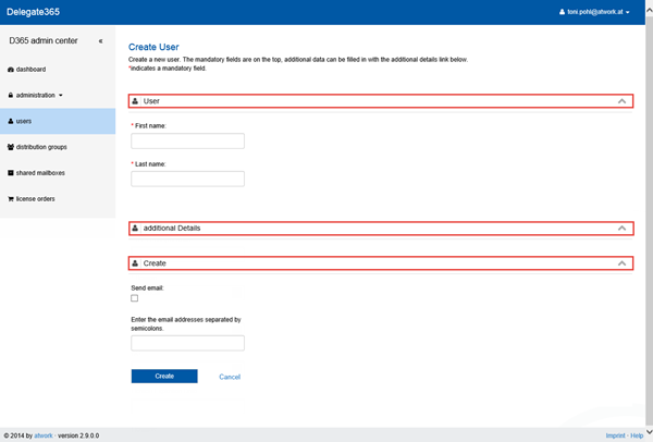
The same “Toggling” now works for all headers, f.e. when creating a new user the fields are grouped into sections with a toggle-icon. This helps to close or open sections.
Lists
…are now shown with alternate line background colors (light grey and white).

Responsive Design
With the new bootstrap framework the responsive design for using D365 on devices with smaller screens like smartphones has been improved. Boxes and groups will now be wrapped in a better way.
Better user experience
A great benefit of using new technics and the new frameworks is that each click results in an immediate response. Even operations which take longer (like accessing distribution lists or sync-operations) show a animated waiting logo and the page is inaccessible till the operation is done.
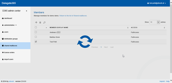
A small notification in the bottom right corner shows additional information if an operation was completed successfully (green) or not (red background).

Improved Technics
We consolidated all Style Sheets (CSS, removed unused ones which have been added gradually) and all Javascript libraries (JS, using CDN etc), minimized and bundled them. The D365 portal now has only one third of HTTP Requests and only the half of weight (KB to transfer) as before. The result is a much faster loading process and a faster page rendering.
Enjoy the new D365 portal!
See here for an overview of other new functions in D365 version 2.9!
Categories: atwork, Delegate365, English, Office365
Source: https://blog.atwork.at/post/Delegate365-changelog-version-29-New-Design
