Grouping in Power Apps can be a little tricky. Here´s how to create a new collection from a data table and visualizing the grouped result in a chart control.
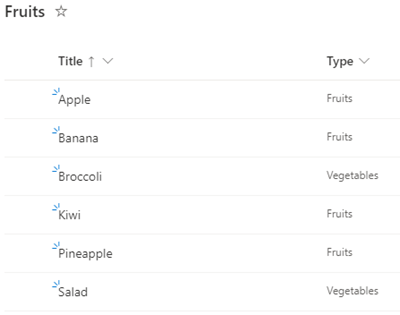
In this small sample, I will show how you can use a data table with the group by function to visualize a summary with a chart in a Power App. The data source is minimal: It´s a SharePoint list named Fruits, containing some items. The Type column is what we want to see grouped by the number of items.
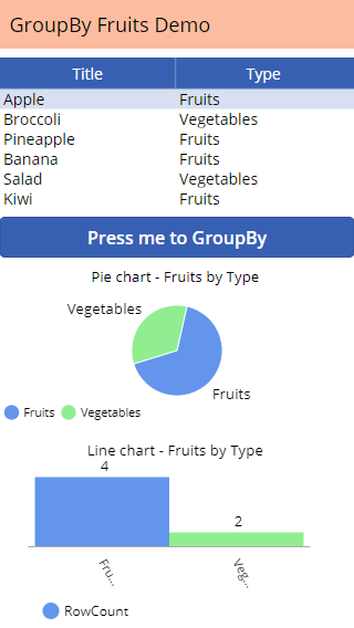
The desired outcome is to get a graphics that shows the products per Type. A datatable control shows the data that is bound to the Power App. Below, there is a button with a formula, a pie chart and a line chart control, as here.
We want to see that there are 2 Vegetables and 4 Fruits in the Fruits list.
We achieve this with the following code in the Button1 OnSelect formula:
// Create a new collection with the number of items per group:
ClearCollect(FruitsByType,
         AddColumns(
             GroupBy(Fruits, "Type","Rows"),
             "RowCount",
             CountRows(Rows)
         )
);
Here´s the explanation for the formula:
- ClearCollect() creates a new collection, which we use as data source for the graphic controls.
- FruitsByType is the name of the new collection.
- The data source name is Fruits. That´s the name of the SharePoint list.
- AddColumns() is a function to shape a table by adjusting its columns: It returns a new table with a transform applied. The syntax is AddColumns(MyCollection - we are using GroupBy() in here -, "Column Name", "Expression"). See more here.
- GroupBy() which is inside the AddColumns() function, returns a table with records grouped together based on the values in one or more columns - here it´s column Type. The syntax is GroupBy(MyCollection, "Group by column", "Name of the group table"). See more here.
- "Type" is the name of the column in our Fruits table which we want to group by.
- "Rows" is a custom name for the generated result table. We use that table as data source for the CountRows() function.
- "RowCount" is a custom name for the column, where we want to store the CountRows() function result - the number of items.
- CountRows() is the aggregate function (it could be also Sum(), Average(), etc.) that does the work. It counts the rows that have been grouped.
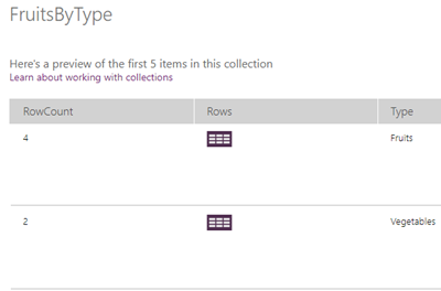
The trick here is to create a grouped table Rows, and use that table to add the column RowCount with the aggregate function to the collection. It took me some time to figure that out since I did not find such a sample in the official documentation. However, when the button is pressed, the FruitsByType collection is created (and overwritten if it already existed) and filled with the expression. In the Collections menu, we see the following table:
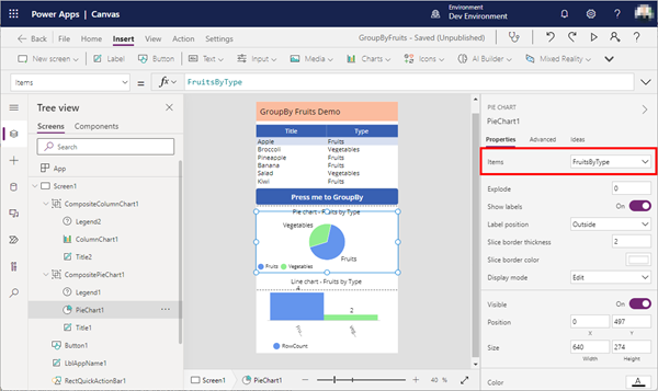
This is the desired result. This collection can now be used as data source for the visualization controls in the Items property.
With the data in the format we require, we can now continue to customize the charts, and modifying the control properties. For example, you can replace the ItemColorSet in the Advanced properties with custom colors, and more.
[Color.CornflowerBlue, Color.LightGreen, Color.BlueViolet]
Have fun grouping with Power Apps!
Categories: App, Cloud, Developer, English, Microsoft365, Office365, PowerApps
Source: https://blog.atwork.at/post/Tips-for-PowerApps-8-Group-and-chart


