Create a file with specific size
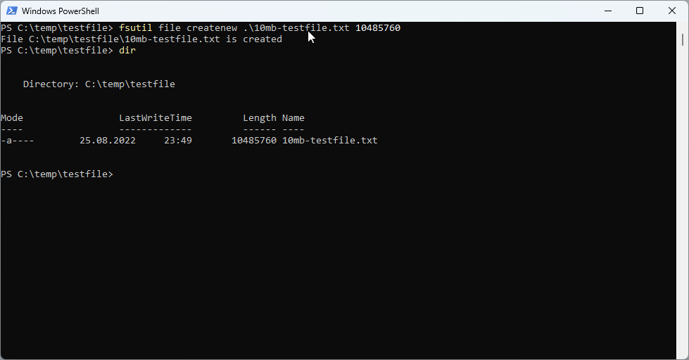
Sometimes it is useful to create a file of a specific size to test network or internet speed or to upload it to a specific application. This is how you can create a file with a specific file size in Windows and with PowerShell. Using the fsutil command line tool For the start, we can use fsutil** command with the file createnew option in a command prompt or in a PowerShell terminal for that purpose. ...